
Let’s be honest. The word “neutral” can sometimes feel a bit… safe. A little boring, even. We picture beige walls, a grey sofa, and a sense of calm that borders on bland. But what if I told you that the most sophisticated, inviting, and downright interesting interiors aren’t built on color explosions, but on a masterful play of neutrals and texture? That’s the real secret.
Think of your neutral base—your whites, taupes, greiges, and soft greys—as the quiet, steady canvas. It’s the calming background hum. Now, the bold accent textures? They’re the rhythm section. The percussion that gives the room its soul and heartbeat. This combination is a powerhouse. It creates spaces that feel simultaneously serene and stimulating, minimalist yet deeply personal. Ready to learn how it’s done? Let’s dive in.
Why This Combo Works (It’s All About Balance)
Our brains, you know, they crave both rest and stimulation. A flat, monochromatic room might be restful for a minute, but it quickly becomes unengaging. A room with too many competing colors and patterns can feel chaotic. The magic of neutral colors with bold textures is that it satisfies both needs perfectly.
The neutral palette provides visual rest. It makes a space feel larger, brighter, and more anchored. It’s timeless. Then, you introduce texture to create points of interest. A chunky knit throw, a rough-hewn wooden coffee table, a sleek metallic lamp. These elements don’t shout for attention with color; they whisper with tactility. They invite you to touch, to look closer, to experience the room with more than just your eyes. It’s a design strategy that’s both subtle and incredibly powerful.
Building Your Neutral Foundation: It’s Not Just Beige and Grey
First things first: choosing your neutrals. This is the crucial first step in creating a textured neutral living space. The trend has moved far beyond basic beige and cold grey. Today’s neutrals are warmer, more complex, and infinitely more livable.
- Warm Whites & Creams: Think Swiss Coffee, Shoji White. These colors are soft, welcoming, and make textures like linen and wood glow.
- Greige: The perfect hybrid of grey and beige. It’s a chameleon—cool in north-facing light, warm in south-facing light. It’s probably the most popular modern neutral for a reason.
- Taupe: A richer, earthier cousin to greige. It has subtle undertones of brown and purple, giving it a sophisticated, cozy feel.
- Warm Grays: Look for grays with green, blue, or taupe undertones to avoid a sterile, corporate feel. These work beautifully with natural materials.
The key is to layer different tones of your chosen neutral. Don’t just paint everything the same shade. Use a lighter tone on the walls, a mid-tone on a large sofa, and a darker tone for an area rug. This creates depth and interest before you’ve even added a single accent.
A Quick Note on Undertones
This is the part that trips people up. Every neutral has an undertone. A beige can be pinky, a grey can be greeny. The trick to a cohesive foundation is to make sure your undertones are consistent. If you choose a warm, yellow-based white for your trim, don’t pair it with a cool, blue-based grey on your walls. They’ll fight each other. Stick to a family of undertones for harmony.
Introducing the Stars of the Show: Bold Accent Textures
Okay, canvas is set. Now for the fun part. This is where you can really let your personality shine. Bold textures are all about contrast—smooth vs. rough, soft vs. hard, shiny vs. matte. Here’s a breakdown of texture categories to play with.
1. Natural & Organic Textures
This is the easiest place to start. Nature is the ultimate texture designer.
- Wood (the rougher, the better): A live-edge slab table, a coffee table with visible grain, or even a wall of reclaimed wood. The knots and cracks add immense character.
- Stone & Concrete: A marble countertop with dramatic veining, a honed travertine side table, or concrete planters. These materials bring a cool, solid weight to a space.
- Woven Elements: Rattan, cane, seagrass, jute. A rattan pendant light, a chunky jute rug, or a cane-backed chair introduces a handcrafted, breezy feel.
2. Soft & Cozy Textures
These textures scream comfort. They’re what make a house feel like a home.
- Chunky Knits and Weaves: A massive cable-knit throw blanket, a Moroccan boucherouite rug, or a heavy-weave linen duvet cover. They add volume and a sense of warmth.
- Plush & Shag: A deep-pile shag rug or a velvet pillow. Velvet, in particular, is a star—it reflects light in a soft, luxurious way, creating a beautiful contrast against matte walls.
- Sheepskin & Faux Fur: Drape a sheepskin over a neutral armchair. Instant cozy factor.
3. Metallic & Smooth Textures
To keep a neutral room from feeling too rustic or earthy, you need to add some refined elements.
- Brushed Brass or Black Metal: Light fixtures, cabinet pulls, or the legs of a side table. Metallics act as jewelry for your room, providing a sleek, polished counterpoint to organic textures.
- Glass and Mirror: A large mirror reflects light and makes a space feel bigger. A glass coffee table keeps the look light and airy amidst heavier textures.
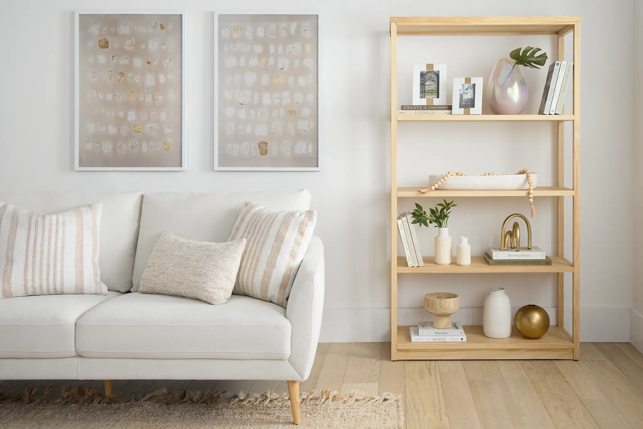
Putting It All Together: Room-by-Room Ideas
Let’s get practical. How does this theory translate into real rooms?
The Living Room
Start with a large, soft grey sectional. Layer a creamy, thick-pile wool rug underneath. Now, add texture: a live-edge oak coffee table, a nubby linen throw in a slightly darker grey, a pair of velvet pillows in a warm taupe, and a tall, woven rattan floor lamp. The colors are all within the same neutral family, but the room is incredibly dynamic.
The Bedroom
Paint the walls a soft greige. Choose a bed with a simple, upholstered headboard in a neutral linen. Then, build the texture on the bed itself—this is your focal point. A crisp cotton sheet set, a heavyweight linen duvet cover, a chunky knit throw folded at the foot of the bed, and a few pillows in varying textures (velvet, cable-knit, maybe even a faux fur). A jute rug beside the bed and simple wooden nightstands complete the serene yet sensory retreat.
The Kitchen
Neutral kitchens are a classic. But to avoid a sterile showroom feel, texture is key. Think of a kitchen with matte white cabinetry, a honed marble countertop (with its soft, tactile feel), a subway tile backsplash with a slightly wavy, handcrafted look, and open shelving made of reclaimed wood. The hardware? Brushed brass. The lighting? A statement rattan pendant. It’s clean, but full of life.
A Simple Texture-Mixing Cheat Sheet
| If You Have This… | Try Adding This for Contrast… |
| Smooth, painted wall | Rough, woven wall hanging or a floating wood shelf |
| Soft, velvet sofa | Hard, polished concrete side table |
| Flat, wool area rug | Nubby, bouclé armchair |
| Shiny, metallic lamp | Matte, ceramic vase |
| Sleek, leather chair | Fuzzy, sheepskin throw |
The Final Touch: It’s a Feeling, Not a Formula
At the end of the day, designing with neutral color palettes and bold accent textures isn’t about following rigid rules. It’s about creating a feeling. A home that feels calm but never cold, interesting but never overwhelming. It’s about building a space that invites you to slow down and appreciate the feel of a well-loved book, the grain of a wooden table, the softness of a favorite blanket.
So, go ahead. Embrace the quiet power of neutrals. And then, don’t be afraid to turn up the volume—with texture.